Powered by Blogger.
When it comes to art materials I love to experiment and usually try a wide variety of different mediums. Since I am often asked what brands I use I decided to spend some time and compile an accurate list of the ones I use every day, love and would recommend for their quality results and versatility:

Watercolours
My very best creative allies when it comes to watercolours are Kuratake and Sennelier (links below). They are bright and brilliant colours with a very high pigmentation making them last very long and therefore strongly recommended especially for beginners. If you would like to add some special shine and brilliance to your paintings you can also opt for the Kuretake metallic golden shades. They are fantastic!
On the lower range I also use Windsor & Newton Cotman Watercolours in tube or travel set. They are not as rich in pigments as Kuratake or Sennelier and would produce less desired quality results but they would be a good budget choice when just starting to experiment with watercolours.

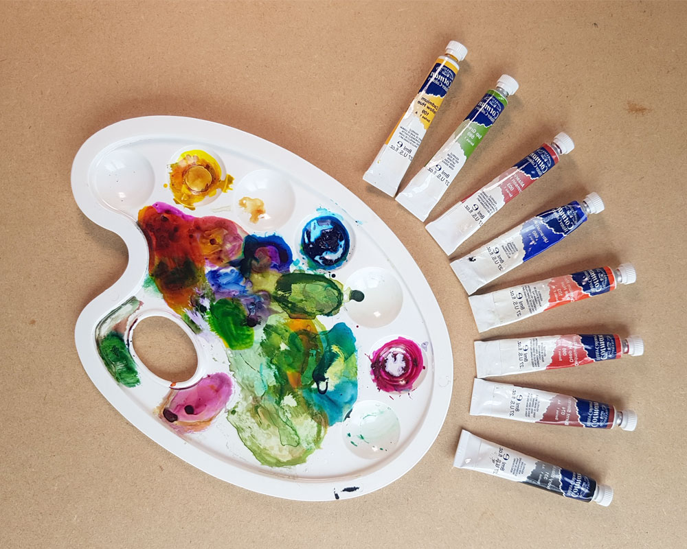
Gouache
Gouache is an opaque medium and so versatile and enjoyable to work with! My favourite brand which I use on a daily basis is Windsor & Newton :
I enjoy blending and creating my own colours. If you are a beginner and know how to blend colours you can just use a set of primary colours and blend all other colours from these ones.

Watercolour pencils
When sketching fast and on the go without carrying watercolour sets with me or simply to render in a different technique I love using my watercolour pencils. A very good brand I use and would recommend is Caran D'Ache.

Pastels
When working with pastels what's important is quality of pigmentation that would deeply affect the outcome of my artwork. A brand which has great pigmentation and which I use often is Faber Castell

Brushes
I normally use flat, round and fan brushes for watercolours and gouache. Usually I would recommend Windsor & Newton or Pro Arte as synthetic brushes for studying and practicing or Pro Arte sable brushes for maximum quality and durability.
Another fun option that I constantly use because so practical are the water brushes especially good when going and sketching around with no need to carry water with you. Pentel is the brand I use and can strongly recommend.

Pencils
I love using different pencils but the one I always carry with me is my mechanical Pilot super grip pencil. Its very practical and allows me to change led

Inks and Ink brushes
I often use black inks in the form of ink tank brushes and ink bottle and brush. below are some of the items I love and would recommend:

Paper
Paper is very important for the outcome of my work. I tend to use a wide variety of different papers depending on what kind of project I am working on and what technique I am using. For every day studies and practice I have my mixed media Canson paper. Other paper pads I use and love are listed below:
Great for practising and with a smooth surface. So good for watercolour, gouache and inks.
These two above are a good compromise between low and high quality papers with a gently textured surface.
This is a higher quality watercolour paper with a fine texture in 100% cotton
This is a beige tinted paper
Eraser
I hope this list helps you to orient yourself around the vast field of art supplies. The list is updated regularly as I get to use, test and work with new materials.
(Some of the links in this post are affiliate links and if you go through them to make a purchase I will earn a commission. However I only link companies I trust and use on a regular basis)


Oooh yes!
Now, I wondered, why kindness and elegance are so soothing to me? What are they, really?
Let’s see.
An art composition, for example, works if there is harmony and balance between the shapes and forms in such a way that, even if these are all different, they would create a union together.
Different shapes that have similar characteristics, like curvy lines and circles, are visually harmonious to our eyes. Contrasting shapes like spiky lines against curves lead to visual discord instead. So, pleasing the eye through mixing different elements would be possible but only if done in a harmonic way.
Stay with me, this is going somewhere!
The same principles apply to nature. Elegance is simplicity, it is accord and agreement of different shapes, forms and colours, it is a ‘tasteful balance of the opposites’ I would say.
However, I find that in the world we are living in right now, too often the main ingredient of a ‘tasteful balance of the opposites’ is missing.
The design, architecture, fashion and art worlds often seems to focus on ‘impressing’, ‘shocking’ and literally celebrating the ‘ugly’, making use of contrasting elements that create no harmony together. In the fast-paced world in which we are living in, there seems to be no need to increase knowledge of quality. What seems to count are quantity and speed. It seems to me that for the majority of people if something can be obtained or made fast then it gains in value.
So for example, learning is good if it can be done quickly, satisfying our sense of accomplishment (no matter 'what' we actually accomplished). A restaurant is excellent if the food we ordered is served on speed and we have the impression it tastes great (no matter 'what' we are actually tasting).
Speed in our lives also affects how we relate to each other and how we communicate, often leaving no space for a graceful and calm attitude. Empathy becomes more and more an obscure concept. The ability to feel how others feel, to be compassionate and kind is often not regarded as a value to pursue in life and certainly not a component of being elegant!
So why is a 1959 movie like Funny Face so soothing?
It’s because the message of its characters, Jo Stockton (Audrey Hepburn) and Dick Avery (Fred Aster), resonates with me. They transport me into an imaginary world where they celebrate kindness, originality and intelligence as the real qualities and values at the base of commercial success.
This is perhaps my biggest wish for 2021:
I hope that our society will focus more on the values of kindness, originality and real beauty, embracing the knowledge of quality that only comes from slow processes, attention to details and genuine empathy towards each other.
What is your wish for this 2021? Would love to know. Feel free to comment below!

Subscribe to:
Posts (Atom)


Social Icons